Showing posts with label Cherries in watercolor. Show all posts

Thursday, October 8, 2009

Still Life With Cherries Lesson 18


The final touches! I used Van Dyke Brown and Perylene Maroon to add some very dark details to the cherry shadows. I used the Van Dyke Brown, fairly wet, to run tiny shadows along some of the stem areas.


Move your piece to another room or in different light. Step back from the painting so you can see it from a different perspective. Hold it up so that you can see it in a mirror. Note anything that you may want to change and let it sit for a while. After some time, go back and make the changes. This is an important time to remember not to overwork your piece. I was once told, if you think you are ALMOST done - STOP!

Sunday, October 4, 2009

Still Life With Cherries Lesson 14

Today I am using a variety of reds from my palette to develop more depth in the cherries.  I used Permanent Alizarin Crimson, Perylene Maroon, and Winsor Red primarily.
I like to use these colors because they are transparent and so when I glaze with them the colors underneath will show through. This makes the colors vibrant and rich.


I added some Permanent Sap Green and Burnt Sienna to the stems on the cherries.

Friday, October 2, 2009

Still Life With Cherries Lesson 12

Quinicridone Gold and Burnt Sienna are the colors of the day! I am using them to add some gold cast to the glass jar, especially at the bottom where the colors are darker because of the way the light is hitting the objects. I used a touch of this color at the top of the jar lid also. Notice the soft edges inside the jar. Some areas of glass will have crisp lines where the shadows are deep, like at the edge of a shape in the glass (notice the letters). Other crisp edges of color can be found around where the light hits the glass directly. All of the other areas will have soft transitions of color by using clear water. Wet edges are soft edges. Dry paper will create crisp edges.

As you look through glass, it will change the values and shapes of objects behind and under the glass. Notice how the jar is a bit darker than the wall.


I guess I have been saying "notice" a lot. Think about it this way: you should look 90 percent of the time and paint 10 percent of the time. The more you LOOK, the more you will see accurately. Then you will be able to create the impression of something realistic.

Thursday, October 1, 2009

Still Life With Cherries Lesson 11

Back to painting the cherries! I want the cherries to look round, so I need to focus on the values, shadows, and the direction the light is coming from. I also need to be sure that I am painting the shadow SHAPES correctly. Since we are creating the illusion of a three-dimensional subject on a two dimensional surface, the sure fire way to accomplish this is by correctly using color, value and SHAPE.

Again, look at the reds on your palette. You may want to add some darker browns to your choices here. I started to use Permanent Alizarin Crimson to work in some of the shadow shapes around the cherries. Be consistent with your light source. If the light is coming from the upper right, be sure the darkest shadows appear on the lower left. Some of the cherries will cast shadows here and there on the other objects.


Monday, September 28, 2009

Still Life With Cherries Lesson 8


Today I am going back to the French Ultramarine Blue and using a very wet wash of color on the folded edges of the towel. As before, I am using my Softened Edge Stroke (see previous posts) to create a soft edge where I don't want a crisp line in the color.

Pay attention to the lightness and darkness (values) of the different shadow areas. The shadows will be darker on one side. There is also some light bouncing around the objects. Squint your eyes to see the different values. In your photo references you will see that one photo is printed in black and white. This also helps to identify the subtle, different values throughout the piece.

Don’t have the references? If you would like to paint along with my blog lesson, you can get the photo references and drawings sent to you by visiting my etsy shop, clicking on the Online Lesson icon, and pay a small fee of $5.00. I will then email the to you the photo references and the drawing.

Friday, September 25, 2009

Still Life With Cherries Lesson 5

Today I have used Sap Green to add a wet wash of color to several areas on the jar. I have again used the softened edge stroke (see previous post) to create soft glazes. I have used different strengths of color (by using different mixtures of pigment and water) to develop some darker values and some lighter values. It's important to use your photo reference as a key. It will guide you as to where you need color, what shapes those colors should be applied, and how dark or light the color should appear.

Because the previous glazes of color were bone dry, the soft application of another color on top of the previous layers creates a depth of color that cannot be achieved otherwise. When glazing several layers of color, be sure to use a very light touch and do not brush too much! Extensive brushing will simply lift and mix the colors and create mud.


Thursday, September 24, 2009

Still Life With Cherries Lesson 4


Using French Ultramarine Blue I paint in the shadowed areas of my still life. I like to do this for several reasons: this helps to establish the foundation, or bones, of the painting; it helps me to identify which direction the light is coming from; it creates an under-layer of cool color where I want the shadows to appear. You will see why this is so important very soon.

To create the soft edges of color on the towel and in some of the other shadow areas, I use what I call my Softened Edge Stroke. I apply a nice, rich, wet stroke of color in a small area, then clean the brush and tamp it on the paper toweling. I use the clean damp brush to pull a tiny bit of moisture INTO the stroke of color. The moistened edge creates a soft edge. It is very important to pull the liquid INTO the pigment and not to pull the pigment out into the clean, wet area. Pushing the water INTO the colored stroke will help to create a soft edge that does not have a funky line of dried pigment, because the water softens the edge to the white of the paper. I hope this makes sense.

I would love to hear your comments! Please click the comment link at the bottom of the blog entry. You can also become a Follower!


Tuesday, September 22, 2009

Still Life With Cherries Lesson 2


Today I want to begin adding my big washes. I like to start with my largest washes, and I often start with the first glaze of a background wash. I used a large, wet puddle of Aureolin Yellow and New Gamboge to wash onto the background. I keep the board tipped, stroke each area only once and allow gravity and water to make the pigment flow. If you use a very light touch on the paper, only using the brush to direct the puddle, your paper will not be disturbed and your washes will be clean and bright.

I also added some of this mixture to the areas in the jar where I can see the background showing through.

Monday, September 21, 2009

Still Life With Cherries Lesson


A New Lesson! It's time to explore a still life painting in watercolor.
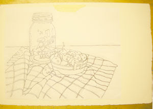
I have worked on a drawing and now I am going to trace it onto my watercolor paper.  I used Arches 300 pound cold press paper. I used a Chunky Graphite Stick (from cheapjoes.com) and applied a thick coat of the graphite to the back of my drawing. I used a tissue or piece of paper toweling to gently rub the graphite. This smooths it out and removes any extra crumbs.

I use one piece of masking tape to secure the drawing to the paper. This provides a hinge which keeps the drawing in place, but allows me to lift it occasionally to see that I am capturing everything as I trace. I like to use a ball point pen to trace. I find that I don't have to push hard, it is easier to see what I have traced since the pen is usually a different color than my drawing, and it provides a nice, thin line on the watercolor paper.

Now I use two-inch masking tape and tape all edges of the paper to a foam core base. Be sure that at least 1/2 in of the watercolor paper is covered with tape all around. If you tape less than 1/2 inch, chances are the tape will not hold when you apply the wet washes of color to come.

If you would like to paint along with my blog lessons, you can get the photo references and drawings sent to you by visiting my etsy shop, clicking on the Online Lesson icon, and pay a small fee of $5.00. I will then email to you the photo references and the drawing.