Showing posts with label wet-in-wet watercolor technique. Show all posts

Monday, February 14, 2011

Print Winner Announcement!

Contest Results (see previous blog post).

There were some great suggestions for the new name of the technique I have been experimenting with for this past year - and some were downright silly! People sent emails, posted comments on my Facebook page, and commented here at the blog.

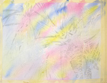
We were searching for something simple, a one or two word description that was not too difficult to remember, yet very descriptive of the technique. I can tell that most of you read the blog entry describing the technique - thanks so much! The technique is modeled after Jean Grasdorf's "pouring" technique, except I don't actually "pour" the paint as Jean does. We wanted a name that would differentiate my method from hers.

Ken and I decided to give Pete Myers, of Oxford, Michigan the print, since he is the closest to our parameters for making the final decision. We will use his term with an addition of one word to make the technique name clear, concise and easy to remember. The small print is of "Cocoa Village Shadows", one of my most recent paintings employing this technique. It is matted and ready to frame.

Again, thanks to everyone for participating. I'll try to have more fun events like this in the future, so stay tuned. Watch for future posts of more paintings created with my "Macro Layering" technique!!!

Wednesday, July 21, 2010

Coconut Jewels

I'm still experimenting with my pouring/dumping technique. This is the latest piece, called "Coconut Jewels". It is 20 x 28 inches and is now framed in a 26 x 32 inch gold, metal frame. You can see this piece at the Art and Antique Studio. If you are interested in purchasing any of my work please email me and I'll post the item on my etsy shop for you.
Thanks for visiting. I love hearing from you!

debbie@watercolorworksart.com

Thursday, July 1, 2010

Palm Tree Wet In Wet Technique Almost Done

The wash is completed and now it is time to evaluate whether I need another wash or if I am ready to remove the masking fluid and see what kind of magic has happened!

I believe the values are dark enough so it's time to move on. The painting must dry completely before I remove the masking.

Monday, June 28, 2010

Palm Tree Wet In Wet Technique

After the first wash dries completely - what I call "bone dry", I then mask the next light values to save. Here you can see the masking. It's okay to use masking tape, or frisket film, but I find that they leave funny edges when the masking is removed, so I stick with brushing on the masking fluid.
So the first masking was to save the absolute whites of the paper. This masking application is to save the value 2 areas. I use a value chart from one to six, one being white and six being black. Each number represents a paint application. So, each stage of the painting is masked to save the next layer of color and value.

Monday, June 21, 2010

First Mask and Wash on Palm

The first thing I did was to apply masking fluid to the absolute whites that I wanted to save. After the masking was completely dry I wet the paper gently with clear water and a 2 inch soft brush. I apply a lot of water so that it puddles on the paper. Then I tip the board back and forth to keep the liquid flowing in all directions so that the paper absorbs the water evenly.

Once the water has soaked into the paper, has lost most of the "puddle" and simply looks shiny, I add the three primary colors. I don't blend them with my brush, I simply drop then onto areas of the paper, tipping the board, allowing gravity and the wetness of the paper and pigments to softly blend the edges. I want to keep this relatively light as these colors will represent the second lightest values in my painting. They will also act as underpainting for the next few washes. This will dry quite a bit lighter than it looks when applied.

Now this has to dry completely - bone dry - before I can work on it again.
More to come....

Slowly But Surely...watercolor...

Slowly but surely I will get this posted.

Because I am using a very wet technique for this painting, and I will be using many layers of wet, blended colors, I don't have to worry about the graphite on my paper. Here I have penciled in lightly, with a number two drawing pencil, the darkest values of my painting. As I add the wet colors the pencil lines will lift and lighten. I don't want to lose my value pattern, so I add the darkest as they will be the last to be added in. If I were using a direct painting method I would be much more careful about the pencil marks. Even with this method, though, I don't want to press hard with the pencil. That would leave impressions on the paper that would cause the pigment to sink in, leaving unsightly marks.
More to come...

Saturday, June 12, 2010

Palm Tree Wet In Wet Technique

Okay, I finally have a few progress photos of the palm tree to show you. You can see my sketch book on the right, my reference photo at the top, my masking fluid on the top right, and a small pencil. At this point I have created a drawing in my sketchbook. I then trace the loose sketch create a value study in only three or four values. I do this with a set of black and gray markers. I use the white of the paper to indicate the lightest values.


This value study will help me to determine where to mask areas before color is added.


These preparatory steps take some time, but the extra time is worth it with the beautiful end results that I can achieve!

Once I have these steps completed I enlarge the value study and use graphite to trace it onto my full sheet of watercolor paper.

Because I will be painting very wet, I use two inch masking tape to secure my paper to a foam core board. This will help to keep it relatively flat while painting and it will pull it flat again as it dries.

More to come soon on this painting...

Monday, May 3, 2010

Come Sit a Spell


Come Sit a Spell...This is a little scene that I stumbled upon in Cocoa Village, Florida. I absolutely loved the pink chairs and it seemed the perfect subject for my new explorations in watercolor technique. I am still playing with a wet-in-wet glazing technique and having a blast! This is definitely a happy painting!!!

With my exploring, I haven't been working on blog lessons as diligently, and I apologize to those of you who like to follow along. I will try to pull some lessons together soon and post them. Let me know if you prefer the lessons or just keeping up with news and images of my current work.

If you are in the Melbourne, Florida area, please look me up. I am a member of the Art and Antique Studio Gallery in the Eau Gallie Arts District (EGAD). Our address is 1419 Highland Ave., Melbourne, Florida. If you visit our website you can see more of my work, our class schedule and information on the featured artist for this month! Hope you can visit us soon. Art and Antique Studio Link.

If you would like more specific information on my classes please visit my personal website. Classes begin again in late May. Click here for class information.

Thursday, April 8, 2010

A recent painting - Moses in the sink

It's been a while since I posted. I have to admit I have been very busy preparing for an upcoming show, The Hibiscus Festival, in Vero Beach, on April 17th.

Here is one of my latest works. I have been experimenting with a new method using lots of masking layers and glazing very wet layers of paint with wet-in-wet applications. I am having lots of fun, and learning a lot! This is Moses, one of my daughter's cats. His name is so appropriate! He loves the water. I painted him with much more gold/warm colors than he is in real life, but I wanted the warmth and yellow tones to compliment the blues and purples in the tile, wall and sink. I am working on a few more paintings using this technique and I will try to post them soon!

Thanks for visiting.

Monday, October 26, 2009

Candy Dish Lesson 9


Okay! Now it's time to dress up the table a little. First, I used a one-inch flat brush with very soft bristles. I loaded it with clean water and gently pulled a puddle of water over the entire table, including the areas of shadow under the dish painted earlier. The only things I left untouched with water were the actual dish, and the candies both in the dish and on the table.

(Special thanks to Anna, one of my students, for shooting these pictures for me!)

It is extremely important not to put pressure on the brush - use a VERY LIGHT TOUCH!!! The brush should basically just push the water around, not really even touch the paper. The less you can stroke the less wash-out or heavy bleeding of pigments you will have.

If you used very thick, heavy pigments for your shadow areas it will lift a lot. You will notice that lots of color flows into the water. All I can say is that this is a good lesson to keep your pigment applications thin, transparent and use lots of water with each glaze!

Now that the table is covered with a generous amount of water, you should see a shine to it. Some areas may still have measurable puddles. Gently tip your board to be sure the water is absorbing evenly into the paper. While it is still shiny, apply small amounts of French Ultramarine Blue and Permanent Alizarin Crimson by dripping it into the wetted areas. Put your brush down and tip the board to create soft areas of slightly blended color.

Notice that I have added some Winsor Red to the red candies. Use any of the bright, warm reds on your palette for the candy glaze. I have also deepened the yellows with a glaze of New Gamboge and a little Quinicridone Gold.

Wednesday, October 7, 2009

Still Life With Cherries Lesson 17


It's time to add some drama to the table.
I mixed some Burnt Sienna and Van Dyke Brown to create a wash for the table. I wanted to give it some weight, a darker value and some texture like wood. First I glazed a little bit of water over the wood table area. This should make the paper damp, not puddled.


Then I used horizontal strokes of strong color and laid on some texture. The wetness of the paper helps to soften the edges. I also tried to make the strokes non-uniform and darker on the bottom right than on the upper edge. This helps to create the illusion of depth.

Tuesday, September 8, 2009

Boat On River Lesson 4

To make the water look like it recedes into the background I need to use some atmospheric perspective. This simply means that the front (closer to the viewer) needs to be a bit different than the back (farther away from the viewer). Any drawing or painting is simply creating an illusion of reality, or whatever the artist desires to represent. I want to create the illusion of a three-dimensional space on a two-dimensional surface.

To accomplish this I wet the entire area that will represent the water, or river in this case. Using French Ultramarine Blue, Antwerp Blue and a very tiny bit of Permanent Alizarin Crimson, I gently stroke a bit of color directly from the paint well, into the very wet area on my paper. To create the illusion of depth I add more pigment to the bottom of the paper (closer to the viewer). I am keeping the distance lighter at this point.

I can create more atmospheric perspective with details later on in my painting, and I will add more details to what is closer, and smaller, less defined details in the distance.

Tip your paper and allow the water and gravity to do some of the painting for you! Wherever you applied water, the pigments will flow. I used my brush to add water into the nooks and crannies around the boat and dock so the pigments would flow there as I tipped the board. If your pigment runs outside of your wetted area, quickly use a dry, clean paper towel and just press (don’t rub) onto the runaway pigment.

Monday, September 7, 2009

Boat On River Lesson 3

Ah, color! I have wet the sky area with clear water, then applied a generous amount of French Ultramarine Blue. By tipping the board I can use gravity, instead of my brush, to make the pigment flow. The lack of brushing keeps the wash nice and smooth as the paper is not disturbed with all of the bristles on my brush.

I have kept the tree line white with the softened edge created by water. The board has been tipped in all directions, but mostly I have tipped it toward the top of the sky so the darkest pigment flows in that direction. When I am satisfied with the value (it should be dark if I want it to look like a sunny day!), I added just a touch of wet Permanent Alizarin Crimson in one corner just to add a little warmth. I like to make the corners of my paintings each a little bit different. This also gives the piece a little depth and variety. Allow this to dry thoroughly. You can use a dryer but don’t hold it too close to the masking, or use a cool setting.

Friday, August 7, 2009

Scooter and Riley Lesson 20

After looking at this piece I realized that I wanted the background value to be much darker to help draw the viewer's eye to the dogs, my focal point. I mixed some Perylene Green into the mixture that I used for the brown area under the dogs to create a wet, rich color for the background. I applied a wash of clear water to the background then, I dripped color from this mixture into the wet background area.

I used strong color and allowed it to flow around by tipping my board. I didn't want to completely cover the gold in the background, but I wanted the gold to shine through here and there. Once I dripped in some color here and there, especially along the edges of the pillows and over the dark areas at the sides of the painting, I put my brush down and just tipped the board to allow the pigment to soften and flow.

When working wet-in-wet with watercolor, the brush is used to drop in the paint, but water and gravity do most of the work.

Sunday, June 28, 2009

Lemons Lesson Number 3

I used clear water to wet the lemons with a nice, juicy puddle. As the water soaks in it will have a sheen, but it won't run over the edges if you tip your paper. This is the stage when you can begin to drop in strong pigments - strong because the water will dilute them. Be sure the pigment is not so thick that it doesn't blend and spread.

With practice you will get a feel for how much pigment and water to use. The pigments should be strong, but wet. I used Aureolin Yellow and Sap Green for the first application here. Let the water do the work for you.

Don't over-brush. Just drip the pigments into the areas where you see those colors and let the edges blend as they will. If you want to move it around at all, tip your paper to direct the flow of the pigment. You can add just a small touch of Burnt Sienna into the darkest shadow areas - just don't over do it. Allow this to dry thoroughly before the next step.

Wednesday, June 10, 2009

Sunflower Lesson 2

Today I am adding a very, very wet wash of Aureolin Yellow to the sunflower petals, seed head, and some of the leaves. I am going to leave the stem white for now. As the wash is very, drippy wet, I can play with it just a little, by dripping in some New Gamboge into some areas. This will create subtle little color plays in the underpainting which are not obvious in the final painting but add richness and volume. Using this wet-in-wet technique creates beautiful soft edges.

Saturday, May 23, 2009

Flamingos Lesson 13

My finished piece!

Hope you enjoyed this one - I know I did!

This lesson is available for you to paint along! Just go to my online etsy shop, click the icon for online class and complete the five dollar purchase. You will then receive an email with the drawings and reference photos for this lesson!

Let me know which lesson you would like, I have several of them on this blog.

I also teach drawing and watercolor classes in the Melbourne, Florida area. If you are interested, visit the Classes page of my website for more details:
http:watercolorworksart.com/Classes.

Wednesday, May 20, 2009

Flamingos Lesson 10

I have used VanDyke Brown as a wash in the background. I have also used it to create more shadows on the palm fronds, areas in the water, and to create some of the darker values in the flamingos. Go lightly on the birds! They should look light and airy, not heavily detailed with dark colors!


Here is a detail of the brushwork
on one flamingo.


Here is a detail of how the VanDyke Brown was used to create shadows around some of the reflections in the water, along the left side of the bird’s leg, and as a wet glaze near the shoreline. Soften edges with clear water when necessary.

Monday, May 11, 2009

Flamingos Lesson

Finally, a new lesson! I call this one, Flamingos Napping.
If you would like to follow along with this lesson, go to my online etsy shop, www.watercolorgirl.etsy.com, click the icon for online class and complete the five dollar purchase. You will then receive an email with the drawings and reference photos for this lesson!

Transfer the drawing to your paper.
With this lesson you will receive several sketches of flamingos in different sizes. Do some thumbnail sketches to see how you might like to arrange them. You can enlarge or shrink the drawings provided to fit your composition better. Once you have a nice composition, transfer the drawings to your watercolor paper.
After you transfer your drawings, use masking tape to secure your paper to a foam core board.

Monday, February 2, 2009

Parrot Study in Watercolor Number 6

I have added another wet-in-wet wash at the base of the background at this stage. I used Hooker's Green and Perylene Green. I didn't want to have the feeling that the bird was floating too much. However, the background really is secondary to what is happening with the focal point of the bird.
To accomplish this wash I added a light, wet wash of Hooker's Green. Then I charged in darker, richer values of the colors I wanted. As they float in the edges are soft and muted, so they are down-played and they don't take away from the crisp detail of the bird.
To keep the edge of this wash very soft, I used a little clean water. The clear water is applied away from the wash and pulled into the wash. This keeps the color moving INTO the wash instead of continuing to pull color out and creating a funny line at the end of the water.