Tuesday, June 30, 2009

Lemons Lesson Number 5

Here I used some of the background mixture and added some VanDyke Brown.

I put this shadow under the plate in a very wet mixture. While it was still damp, not completely dry, but wet enough to allow the edges of the paint to soften, I added some Perylene Green to the closest area under the plate.

This is where the shadow is the deepest and darkest in value because it is the most hidden from the light source. Just a touch goes a long way. I want to keep the majority of the shadow in the brown tones.

Here you can see I have added some of these colors to the plate and bowl as these will be reflecting onto the clear and white shiny surfaces.

Monday, June 29, 2009

Lemons Lesson Number 4

Today you will use the colors that you used in the previous application, but wet them so they are not quite so strong. We will paint these colors directly into the glass bowl where they are reflected.

Be sparing; use a light touch. It is better to start out too light, especially when you are doing this for the first time.

As you get more comfortable with glazing colors and where to put the colors in reflected objects, you can be more direct with color. For now, put in delicate color in just a few areas. Remember, the glass is reflecting what is around it, and it is sitting on a white plate, so there will be a lot of light in the glass bowl.

Sunday, June 28, 2009

Lemons Lesson Number 3

I used clear water to wet the lemons with a nice, juicy puddle. As the water soaks in it will have a sheen, but it won't run over the edges if you tip your paper. This is the stage when you can begin to drop in strong pigments - strong because the water will dilute them. Be sure the pigment is not so thick that it doesn't blend and spread.

With practice you will get a feel for how much pigment and water to use. The pigments should be strong, but wet. I used Aureolin Yellow and Sap Green for the first application here. Let the water do the work for you.

Don't over-brush. Just drip the pigments into the areas where you see those colors and let the edges blend as they will. If you want to move it around at all, tip your paper to direct the flow of the pigment. You can add just a small touch of Burnt Sienna into the darkest shadow areas - just don't over do it. Allow this to dry thoroughly before the next step.

Saturday, June 27, 2009

Lemons Lesson Number 2

Today is section two of this lesson. I mixed a puddle of paint in the large mixing area of my palette. Here you want to be sure that the puddle will be large enough to cover the entire area. If you have to stop and mix more paint, your wash will dry and be ruined before it is completed. Always mix more than you think you will need. You will see that many times you can use up the remainder of the puddle later, sometimes in another painting.

For the background I used lots of water, Burnt Sienna, Quin Gold, Permanent Alizarin Crimson, and a touch of VanDyke Brown. I used a one-inch flat to quickly lay in the wash. Don’t stroke more than once in an area as this will stir up the paper and effect how the paint lays. I wanted a nice, smooth wash for the background. Allow this to dry thoroughly before moving on to the next step.

Friday, June 26, 2009

Lemons Lesson Number 1

Today is the beginning of a new lesson. These lemons, or limes, were in a glass bowl at the Art and Antique Studio Gallery, where I work and teach. I'm not sure if they were green lemons or ripe limes, so I'll just call them lemons for now. The principles we will use for this painting will work either way.

If you would like to paint along with this lesson, for five dollars you can go to my etsy webstore and order the photo reference and drawing by clicking on the online class icon. Once your payment clears, I will send you the photo and drawing via email. Several people have said they printed out the lesson each day, and then they had the whole plan before they started. It has been fun to see the pieces that people have produced from my blog lessons!

Okay, now to get started…
The first thing I did was prepare a drawing from my photo references.

I used graphite to coat the back of my drawing and then I taped it on one edge to a 10 by 14-inch piece of Arches 140 pound cold press paper.


Next, I masked the areas in the bowl and plate where I wanted to protect the white of the paper. It is very important to apply masking thoughtfully. Whatever marks you use with the masking fluid will remain when you lift the masking later in the painting process.

Wednesday, June 24, 2009

Old Fisherman Watercolor

This is a painting I finished recently. I had a reference photo that I shot at the Sebastian Inlet here in Florida. I love that place! There are always interesting characters fishing at the end of the pier.

I changed a lot with this guy, except for the pensive look on his face. His clothing and cap are different from the photo and I made the decision to eliminate all of the extra noise in the background to highlight the warm tones and wrinkles in his face.

I call this one "Old Fisherman", and it measures approximately 14 by 20 inches.

This was an incredibly fun piece!

Monday, June 22, 2009

McKee Garden Water Lily Festival

Last Saturday, a few of the ladies from the Art and Antique Studio Gallery went to the McKee Gardens in Vero Beach, Florida. The folks at McKee were holding a Water Lily Festival in their beautiful gardens and ponds.

I was part of the gallery group and spent nearly two hours (not enough time!!!) taking photos. I saw more colors of water lilies than I ever knew existed.

Besides the record heat (high 90's), the day was absolutely beautiful and the light was perfect for the photographers who enjoyed the sights.
Above left are Therese and Barbara shooting a few scenes from a shady spot near the main pond.


Here is just one of the 160 photos I took that morning. I am sure there will be a few new paintings of water lilies this year!

Wednesday, June 17, 2009

Sunflower Lesson 9

The final addition to this piece was another glaze of French Ultramarine Blue (mixed to a coffee-like consistency) used on the flower head an the darkest value shadows.

And here is the finished sunflower. This technique of building a painting in glazes is fun. It is great for those who think their paintings look to light or thin. It's a great exercise for those who paint too heavy (with thick, opaque pigments), to practice using more water and to allow the different colors to build value and life into your work!

If you would like to paint along with any of these lessons, you can order the photo reference and drawing online at http://watercolorgirl.etsy.com, just click on the icon for the online class.

Tuesday, June 16, 2009

Sunflower Lesson 8

Today I am glazing more greens over the leaves, adding subtle variations in the glazes with water to create the illusion of volume and shape.
I have also used Permanent Alizarine Crimson to the bottom of the stem. I worked a very small area with rich, wet color, then quickly washed clear water along the sides to soften the edges.

Using VanDyke Brown and Burnt Sienna in separate glazes, I work in more details on the flower head and flower petals. I want to be sure that I leave some of the yellows and small bits of the white of the paper shining through to provide a sparkle and vitality to the finished piece. I used the VanDyke Brown to glaze in more shadows under the flower on the top of the stem and to the shadow sides of the stem.

I also worked a thin wet wash of Hooker's Green over the leaves to tie them together a little more.

Monday, June 15, 2009

Sunflower Lesson 7

I have also begun to use a stronger, but still very wet, wash of Burnt Sienna to the details of the sunflower head. It's important at this stage, to pay close attention to the direction of the light. I want to paint darker values and the shadow areas to create the illusion of shape. As I work the brown pigments over the dried blue glaze, the blue disappears, yet adds value to the brown washes.

Sunday, June 14, 2009

Sunflower Lesson 6

I have used a very wet wash of Sap Green mixed with Aureolin Yellow to glaze over the green areas of the leaves. When this is dry you can add more details if you like. I want the sunflower head to be the focal point, so I am saving my detailed brushwork for that area.

If you would like to paint along with this lesson, you can order the photo reference and drawing online at http://watercolorgirl.etsy.com, just click on the icon for the online class.

Saturday, June 13, 2009

Sunflower Lesson 5

Using New Gamboge and Quinicridone Gold, I am beginning to add some color and texture to the sunflower head and petals. I use my Brush Dance and the Pull-Push Stroke for this technique. These are shown in detail on my DVD (http://watercolorworksart.com/Classes).

For both of these strokes I hold my number 10 round brush nearly straight up and down. The Brush Dance is just a bouncing, scribbling motion made while holding the brush with a very light touch.

The Pull-Push Stroke is executed by holding the brush close to the bristles, nearly straight up and down, and gently (light touch) pulling the brush, and then gently adding pressure while pulling it. These strokes are both fun ways to make beautiful marks on your paper!

Friday, June 12, 2009

Sunflower Lesson 4

Today I am adding some Sap Green to the leaves of the sunflower. Again, I am working very wet, especially on the sunlit leaf on the upper left. I can use a stronger mixture of paint and water to create the rounded shapes on the leaf at the right because I will soften the edges here and there with clear water.

Thursday, June 11, 2009

Sunflower Lesson 3

Here I am using French Ultramarine Blue, very wet (like a weak tea), to begin building some shadow areas in my painting. I squint at the photo reference to see where the darkest shadows are. I don't want to over-do this as it will make the flower look too dark and dull. The blue underpainting will, however, add a darker value to subsequent warm colored washes.

Wednesday, June 10, 2009

Sunflower Lesson 2

Today I am adding a very, very wet wash of Aureolin Yellow to the sunflower petals, seed head, and some of the leaves. I am going to leave the stem white for now. As the wash is very, drippy wet, I can play with it just a little, by dripping in some New Gamboge into some areas. This will create subtle little color plays in the underpainting which are not obvious in the final painting but add richness and volume. Using this wet-in-wet technique creates beautiful soft edges.

Tuesday, June 9, 2009

Sunflower Lesson 1

This sunflower painting has become a fun project that I bring in on a regular basis for my beginning students. It has all the essential element s of how to build a watercolor painting, including washes, glazing and brush work.

If you would like to paint along with this lesson, you can order the photo reference and drawing online at http://watercolorgirl.etsy.com, just click on the icon for the online class.

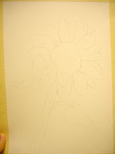
I begin by transferring my drawing to my watercolor paper. I like to use Arches. It is a wonderful, durable paper that holds the color well. I then, tape the drawing to a foam core board with two-inch masking tape. This holds it in place as I paint the wet washes, and will pull it back to a flat state as it dries. Be sure to cover at least 1/2 inch of the paper with your tape. If the tape doesn't have a good grip, the paper will pull out when it gets wet.

The next step is to float a big, juicy wash of French Ultramarine Blue around the outside edge. Be sure not to outline or get ahead of the wash. If you want a smooth wash, paint wet, create a bead of paint flowing toward the direction of the next stroke. To keep the bead in the right 
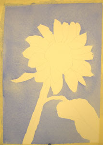
place, tip your paper slightly. To learn more about how to create a beautiful flat wash, you can get my Beginner's Watercolor Workshop DVD at http://watercolorworksart.com/Classes. The DVD is $27.00, plus $3.00 shipping and handling. It contains over an hour of instruction, plus you can put the disk into your computer and print the 20-page workbook.

Monday, June 8, 2009

Arches Study - Student's Work

Just for fun, I wanted to share some
of the student's pieces from the last
project of the Arches Painting.
I think they are really lovely!

Nice job, ladies!

Sunday, June 7, 2009

Arches Study Workshop 9

I used a very wet mixture of New Gamboge and Quin Gold to wash over the building and sidewalk area. I wanted to emphasize the sun shining on the brick. I added some Quin Gold to the leaves around the flowers as well.

This is the finished piece! I really enjoyed painting this one. If you enjoyed this lesson, you can order the photo reference and drawing online at http://watercolorgirl.etsy.com!

Stay tuned, another online lesson is coming soon!

Saturday, June 6, 2009

Arches Study Workshop 8

Here I begin using a smaller brush and add glazes of VanDyke Brown, Burnt Sienna, Quin Gold, and darker mixtures of greens to build in some of the details. Using a light hold on the brush helps to keep the brushwork looking painterly. I have also used Permanent Alizarin Crimson to create little shadows on the flowers.

Friday, June 5, 2009

Arches Study Workshop 7

Using a very wet wash of Sap Green, I apply a Brush Dance to the greenery. I have also worked in some Quin Gold and Burnt Sienna on the shadow areas of the building.

You learn more about my Brush Dance technique, by purchasing the Beginner's Workshop DVD. I discuss many types of wash techniques and brush work on the DVD.
To see more click here:
http://watercolorworksart.com/Classes


After the first green wash is bone-dry, I apply another set of brush marks with a slightly darker value pigment.
I added a tiny bit of Hooker's Green at this point.

Thursday, June 4, 2009

Arches Study Workshop 6

Today, I am adding a very wet mixture of Winsor Red to scribble on some bases for the flower heads. I am also using Burnt Sienna and Quinicridone Gold to develop some of the glazes on the darker shadows.

This is where the magic begins! When the warm brown tones are glazed over the transparent blues, the blue begins to disappear, and the browns are not washed out shadows, but dark, warm, rich, transparent shadows! I use some of this mixture to warm up some shadows on the building as well. These little strokes are lightly danced over the surface with a number 10 round brush. I don't want it to look tight or fussy, as this is still a foundational glaze for the details to come.


I have also used some French Ultramarine Blue and a little Antwerp Blue to create a wet wash for the sky.

If you would like to paint along with this lesson, you can order the photo reference and drawing online at http://watercolorgirl.etsy.com, just click on the icon for the online class.

Wednesday, June 3, 2009

New DVD Snippet and Upcoming Art Show

A few days ago I posted a snippet of the new Beginner's Watercolor Workshop DVD on Youtube. You can watch the snippet by clicking HERE.
Link
Be sure to let me know what you think. If you would like to order the DVD you can order from my website: http://watercolorworkart.com.

I also wanted to invite the locals to a wonderful gallery show coming up at Art & Antique Studio Gallery in the Art District of Melbourne. The gallery is at 1419 Highland Avenue one block south of the Brevard Art Museum. Every first Friday of the month the Art District hosts a Gallery Walk from 5:30 - 8:30 PM. There are also some very nice restaurants in the area, so you can enjoy the food, live music, and art in several galleries.

Art and Antique Studio is hosting an invitational show called Art In Miniature. Over 100 pieces of framed artwork came in for the show, which boasts several awards, and some amazing artwork. Each piece of artwork measures 12 by 12 inches or less, including the frame. Stop by on the First Friday Gallery Walk, or anytime throughout the month of June. It will be a real treat!

Arches Study Workshop 5

At this stage, I have allowed the painting to dry completely. I am using Aureolin Yellow and New Gamboge, very wet, like weak tea, and scribbling on a light, rough wash over the entire building. The building doesn't have to be covered entirely, this is just an underpainting that will give a foundation to future glazes.

Tuesday, June 2, 2009

Arches Study Workshop 4

Here you can see that I have worked in lots of variation in the values which begins to show the forms and depth of my subject. I use clear water to soften edges, where necessary.

A variety in soft and crisp edges adds texture variety and detail to your work. Soft edges give your viewer's eyes resting places as they look around the painting.


I am leaving the green and floral areas white for now so that I can paint them in later. The flowers will become the focal point of my finished piece.

The arches can work as directional lines to draw the viewer's eye to the flowers. The most detail will be saved for the floral area.

Monday, June 1, 2009

Arches Study Workshop 3

Now I am using two blue paints to develop the initial values: French Ultramarine Blue and Prussian Blue. Using my value chart (see the entry two days ago for more on Value Charts), I try to locate the dark values from number 4 through number 6. I use these blue pigments to begin to build the values. I work very wet, use simple, light brushwork, and I try to avoid brushing in the same area with more than one stroke. If I need to add more color I allow it to dry first.