Thursday, March 26, 2009

New Lesson for This Weekend!

This piece, Pink Hibiscus, will be the next lesson here on my blog. If you would like to paint along, please visit my etsy shop (http://watercolorgirl.etsy.com). Click on the icon for the Online Class. For $5.00 I will send you a pdf of the drawing and photo reference. Then, you can visit back on a daily basis, or whatever is convenient for you, to paint along!
This piece was painted on a full sheet of watercolor paper, 23 x 30 inches, but you can also paint it smaller, if you like. The reference will be sent in a small format, which you may enlarge to full size.
Hope you can join us.

Monday, March 23, 2009

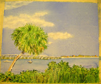
Palm Tree on Indian River Lesson 9

The final painting.

This was a fun piece. I hope you enjoyed it. Stay tuned as I will be posting a new lesson soon! If you would like to work along with a lesson that was posted in the past please email me. Let me know which lesson, then you can order the reference materials via my etsy shop.

To see more of my completed work, please visit my website:
http://watercolorworksart.com

To purchase prints you can visit one of the many galleries in Michigan, Ohio and Florida that carry my work, see my website for details.

To take a class locally visit: http://watercolorworksart.com/Classes.

Thanks for visiting!

Sunday, March 22, 2009

Palm Tree on Indian River Lesson 8

Now I will work on the clouds!

I used a very clean, wet, number six round brush with very soft bristles. Making a small circular motion, I lifted and softened the edges with a very light touch. I used a paper towel to gently lift the wetted area. I used the same technique, only with more pressure, to lift the whiter, lighter areas of the clouds. When working on this section, note that clouds have a light and dark side, especially if they are somewhat thick and billowy. The edges should be rounded, soft and irregular. Let the painting lead you.
Don't overwork this stage, just stand back and see where you think the cloud should be lighter, here and there. If you have clouds in the sky today, take a close look at them. Notice where the lights and shadows are. Notice how the shapes look. Clouds are very forgiving and fun to paint because you can make them up as you go.

When this is dry, mix a tiny bit of French Ultramarine Blue and Burnt Sienna in wash that is about 90 percent water and 10 percent (or less) pigment. With your number six round brush, apply a tiny bit of this mixture to shadow areas of the cloud and immediately clean your brush and soften the edges of the wash with a damp, not wet, brush. Be careful not to apply shadows that are too dark or too uniform. Clouds don't really have sharp edges, so to make yours believable, you have to have subtle edges, shapes and values.
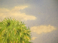
Evaluate your work.

Hold it up in a mirror to see it with a fresh eye. If you have overworked any areas you can do some softening and lifting. During my evaluation of this painting, I felt that I had over worked the foreground, which took away from what I wanted to be my focal point (the boats and palm tree). I mixed a very wet, pale wash of Sap Green and Burnt Sienna and washed it over the foreground, making sure I used very little pressure on my brush and not stroking the area more than once. I used a number 16 round brush to keep from over working and blending too much. I liked the softening effect this had on the area. I still had some texture and value changes, but it was less focused and thus brought the eye back to the palm tree.

Saturday, March 21, 2009

Palm Tree on Indian River Lesson 7

Here I used Van Dyke Brown to add some detail to the trunk of the tree, and to work in shadow areas around the painting. I used it to glaze over the blue shadows that I applied in the last glaze. This warms them up and deepens the value even more. Just applying the same color will only make the paint thick, it won't make it darker. To increase the value of a color, I use a color opposite in temperature as a glaze. For example, if I have used a blue for shadow areas, but I want the color to be darker than what I can produce with that blue, I will glaze over the blue with a warm color like Van Dyke Brown or Burnt Sienna. I works like magic!

At this stage I also worked around the painting to clarify values, clean up edges and to paint light value glazes over some of the harsh, masked areas of the tree and grasses. A wet, light value over these areas will soften the edges of the crisp, masked marks.
I used Burnt Sienna and Quinicridone Gold for the buildings, again, not putting in details, just basic shapes.

To see the beginning stages of this painting you can visit the previous posts for this blog.

Friday, March 20, 2009

Palm Tree on Indian River Lesson 6

I have used a Masking Fluid Pickup to remove all the masking. This tool is wonderful! It quickly and cleanly removes all of the masking without smearing or smudging your painting. You can purchase this tool at most art supplies stores, and also online at CheapJoes.com.

Using French Ultramarine Blue I have added some shadows to my palm tree trunk, and to the boats and bridge. Even though we are not painting the minute details of the bridge, the direction and value of the painting in the shadow areas is very important. Notice the little angle of the shadow on the pillars under the bridge. Also notice that the shadow directly under the roadway is a different value than the pillar shadows.

Use care when applying the shadows to the boats also. I try to pay attention to value (lightness and darkness) and shape. It helps to squint at your reference photo to see the values and shapes. When these elements are given attention, even a single, tiny brushstroke will make your element believable.

You can see more of my finished artwork at http://watercolorworksart.com.

Thursday, March 19, 2009

Palm Tree on Indian River Lesson 5

At this stage, if the masking is completely dry, I can begin to apply more green values to my palm tree and to the foreground. Some colors used were Hookers Green, Quinicridone Gold, New Gamboge and Earthen Green. Because I have used the masking, I can work very wet dropping in a variety of colors and allowing them to flow and intermingle. I dry the work with a hair dryer on the cool setting (to prevent the masking from baking into the grains of the paper). Then I mask areas where I want to save this stage of greens, golds and browns.

I continue with the masking and wash process until I am happy with the value range. Mask, dry, paint, dry, and repeat. For the final values on the green areas I used Perylene Green and VanDyke Brown. With a number 6 round brush, I added soft brush strokes to the very darkest, shadowy areas.
Finally, I added some Earthen Green to the tree line in the background. While this application was still moist, I softened the edge of the tree line with a clean, damp brush to take away the crispness. I want a soft edge along this area so that it appears that the atmosphere is softening the elements that are far away. Dry thoroughly.

Wednesday, March 18, 2009

Palm Tree on Indian River Lesson 4

For this stage, I used a very wet mixture of Permanent Sap Green and a little Aureolin Yellow to create a lemon yellow wash for the first glaze on the trees and greenery. I applied the paint VERY WET. To the puddle, I dropped in a little Burnt Sienna here and there where the palm fronds will look more brown near the bottom of the tree. I also added a little Burnt Sienna, wet-in-wet, to some areas of the grasses in the foreground. I like to add this earthy color to my greens to keep them from being too garish. Usually in natural settings, you will see browns and golden colors within the greens. You can see how nicely the masking fluid is resisting the paint and holding the white areas. Allow to dry or dry with a hair dryer on the cool setting.
When this application is bone-dry, I apply more masking as I did in the number two lesson of this project. Do not apply masking to the damp or moist paper, as you will not be able to remove it and the lines created will not be crisp. I apply the masking to the next lightest value. For instance, the first application of masking was to protect the very lightest color of white. Now I am adding masking to protect this value of color that I just applied. I want to be frugal. If I add too much masking the painting will look contrived.
Look for the light values for this stage in the palm fronds and in the grassy areas in the foreground.
Visit previous posts to see the other stages of this painting in progress.